Over the next few blogs, I’d like to go over image and its importance in business.Â
I know we often say, “Oh, it doesn’t matter what it looks like†or “People don’t pay attention to that.â€
Well, I’m people, and I pay attention to everything. I know that brand image, as well as our professional and personal image, are all equally important, which is somewhat unfortunate because it is a lot to keep up.
However, let’s do the work.
And I think the more that we do the work, the easier it becomes, and in time, we can hire others to assist us with this image. If you don’t have a pr team or brand manager to help things consistent, then I would definitely suggest that you take your image into your own hands. Take agency over it. It is important; it is your moneymaker if you’re doing it correctly.
So today, we are discussing brand image. As a media outlet, yes, I’ve noticed that other outlets often don’t put as much effort into things like their graphics or their website. These things are still important to SwagHer Magazine and me, especially as we are working on competing in an industry where our location already serves as a disadvantage.
So we put lots of emphasis on these things. If you look at our Instagram page, you should see the common theme of black, purple like fuchsia, and turquoise, almost teal colors. Initially, the brand colors were black and fuchsia, but we were solely marketed to women back then.
Then we began to include content for men, and we added the turquoise. This way, we’d have the option to switch out the designs when we post male-friendly content, and we wanted Black men to know that they were not excluded. We didn’t want them to look at the image and instantly think, “Oh, this is just for women.â€
Obviously, the black color stands for everything that we are in and that we believe in.
Brand colors are important. Not only does the fuchsia stand for feminine energy, but it also is closely related to purple, which means royalty.
Here’s a look at the Color Emotion Guide if you are still trying to decide on your colors or considering re-branding.
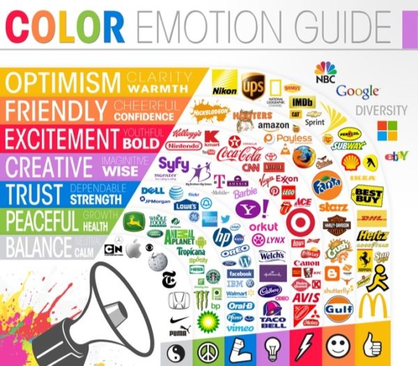
I would also suggest reaching out to your graphics person for your color codes for future projects.
Now, let’s take a look at our website.
Yes, we could have many running articles back to back vertically, but we wanted our site interactive. We wanted it to be aesthetically pleasing when you look at it. And so, again, we matched our colors with the black, fuchsia, and turquoise in some places.
The turquoise is more of an accent here. But as I add on widgets, such as our chat widget or our sales notification plugin. I’m incorporating more turquoise. I can’t help it. I struggle to tolerate things that aren’t pleasing to the eye, but I’m fortunate to know to still look below the surface, whether it be of things or people.
I’m going to go over plugins and widgets soon, but also try to match your fonts as well as you possibly can too. If you don’t know your fonts, you can go back to your graphic designer and ask them to write them out, or you can use the WhattheFont.com website and upload an image like your logo or something that has the desired text on it. The program will scan the photo and tell you what type of font you have within the selected text area. It only does one font a time, but you can re-upload and do others.
I wouldn’t suggest more than two-three font variations in your design. Sometimes the fonts you need are free, but they usually cost a little… or a lot. If you use a program like Canva, you can upload the fonts to ensure all of your brand’s looks match.
Of course, this is just the beginning of branding your image. By now you may have already done these things, but no worries, we’re going deeper but next week we’re going to talk mission statements.Â