I was going over an interview with CEO Kim Cross of Zhi Bath & Body for one of our upcoming Travel Books, I decided to share some information I gathered from Kim’s experiences about product labeling and packaging.  Zhi is a vet-owned/Black-owned natural skincare line. Many of their products include goat milk and Shea butter, and they are great for sensitive skin. Here’s an image of a few products.
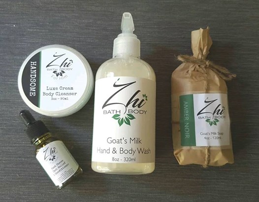
Notice how cute and refreshing her labels and packaging are! Who would’ve thought Kim had such a hard time with this task. She referred to it as “the thorn in her sideâ€, but I found her method to be insightful.
How It Started:
“I was never really satisfied. I put something together, and basically, I just wanted it to look cute sitting on the side of somebody’s stuff or someone’s tub. For what I had, it looked ok. My mom uses my product, and I know she also  likes for the side of her tub to look pretty, so that when she gets in there she is like ‘oh, this looks nice. Let me try this one today,â€and yet still when guests come, it continues to look nice . So that’s what I did for years and years, and then I got kind of bored. I felt the need to do something more with it, because it looked handmade, though cute and not necessarily cheap. It looked cute and maybe like ‘I want to keep buying this with my normal norm just because it looks professional.’â€- Kim
What was the problem?
Kim explained that there is a market every year in downtown, called Vintage Charlotte, where the vendors have to apply to participate. The organizers then choose will take part in the event. The Navy vet had applied for several years but was repeatedly denied. Though she began to suspect what the problem was, she had a mentor meeting with the lady who started the whole show.
“She said that my packaging did not match the quality of my products, and I alrady knew that. I was getting so aggravated with it, because I had put so much into getting the product right, that I hadn’t – I had, but not- really paid attention to the packaging. She ended up laying it all out there for me, and it was simple. Well, not as simple. It was about four or five products for her to look at, and I’m sitting there. We had laid everything out, and I’m like ‘wow, that looks like I bought that from over here, and I bought that from this store, and that from that store and that one- I don’t know.â€- Kim (Problem #1)
The organizer shared the following advice with Kim, “When someone comes to your table, you want them to say, “Oh my goodness, that looks like nice!†Then they pick it up, smell it, and look again. Then (they) say, “Oh, and I want this too and everything matches. I was like what? I can make it match, but what I didn’t realize was how hard it would be to come up with packaging that still reflects Zhi but looks like a high quality product but still have my whole line match.â€- Kim (Problem #2)
Steps to the Solution:
So Kim was confident she could make the line match but decided to upgrade her logo a little as she described the first one as looking like “it was thrown together in a Word doc.â€
She created a brand board, which is much like a vision board.
- “I had my little vision board on the wall, and I’m on Pinterest and this other site. I have always been so fascinated with the packaging they offer, because it has an oriental feel, but it also has a nice handmade eco-friendly feel to it too. So I took pictures and images of my own thoughts that I had hand-drawn, and I stuck them all on the board, and I stood and looked at that board.
All the packaging now is based off of soap, because that was the biggest thing that I struggled with. I knew that if I could get the soap the way I wanted it, I could get everything else to go along. Because if I could get the soap, everything else is either a jar or a bottle. So if I got the soap, and I got the logo, I’m good.Â
- I made like six bars of soap and laid them out three different ways. Then I made sure it all meshed. I did a lotion and a lip balm in two different sizes. I sat it all together to see if it all looked right, but it didn’t look right. So I said, ‘Ok, if it square or rectangular it will have a square label. If it is a bottle, a tub, or a tin, it will have a round label.’ Then it was just a process of elimination, after I’d played with it for an afternoon.â€
Once Kim got it narrowed down to three ways to package the soap. She showed it to the graphic designer who combined it with Zhi’s new and improved logo, and two days later he had something. “I’m glad I didn’t have to deal with that, because I can’t draw, “ Kim says.
Recap:
Kim suggests that it all starts with research, knowing what is out there so you can see where you can fit in, because if you don’t know your competion and you don’t know what other people that are already kind of where you want to be are doing,then you will be tryiing to figure it out forever. Create a vision board, try out samples, and narrow it down. You can keep going back to that until you actually have a line that when you lay everything out together, you are like, ‘wow, that looks great!’
To connect with Kim and Zhi be sure to visit https://www.zhibathandbody.com/store/c1/ZhiOnline or follow on IG: @zhibathandbody.
Kim Cross will be the cover of one our two upcoming Travel Books. If you would like to include your business in the Travel Book, contact us at advertise@swagher.net.Â